In the digital age, where mobile devices have become ubiquitous and users increasingly rely on smartphones and tablets to access the internet, mobile-first web design has emerged as a critical strategy for creating successful online experiences. Mobile-first design prioritizes the needs of mobile users, ensuring that websites are optimized for smaller screens, touch interactions, and slower internet connections. By embracing the mobile-first approach, designers can create websites that deliver a seamless and intuitive user experience across all devices, catering to the needs of today’s mobile-centric audience.
1. Understanding the Mobile Landscape
The rise of mobile devices has fundamentally changed the way people access the internet. Mobile traffic has surpassed desktop traffic in many industries, and mobile devices are now the primary means of accessing the internet for a large portion of the population. Designers must understand the unique characteristics of mobile devices, including smaller screens, touch-based interactions, and varying network speeds, to create websites that perform well on mobile devices and provide a positive user experience.
2. Prioritizing Mobile Users
Mobile-first design places mobile users at the forefront of the design process. Instead of starting with a desktop-centric approach and then scaling down for mobile devices, designers begin with the smallest screen size and build up from there. This ensures that the most important content and features are prioritized for mobile users, leading to a more focused and streamlined user experience. By designing for mobile first, designers can create websites that are optimized for the devices that users are most likely to use, resulting in better engagement and conversion rates.
3. Responsive Design and Flexibility
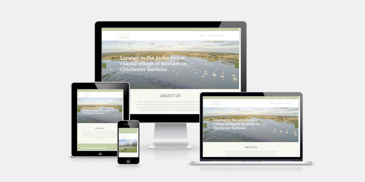
Responsive design is a key component of mobile-first web design. Responsive websites adapt and respond to different screen sizes and orientations, providing a consistent and optimal viewing experience across all devices. Designers use techniques such as fluid grids, flexible images, and media queries to create responsive layouts that adjust dynamically based on the size of the screen. By embracing responsive design principles, designers can ensure that their websites look and perform well on a wide range of devices, from smartphones and tablets to desktop computers.
4. Optimizing Performance and Speed
Mobile users expect fast-loading websites that provide a smooth and responsive experience. Designers must optimize their websites for performance and speed to meet these expectations. This includes minimizing file sizes, optimizing images, reducing the number of HTTP requests, and implementing techniques such as lazy loading and asynchronous loading to prioritize critical content and improve page load times. By prioritizing performance optimization, designers can create websites that load quickly and deliver a snappy user experience, even on slower mobile networks.
5. Continuous Testing and Iteration
Mobile-first design is an iterative process that requires ongoing testing and refinement. Designers must continuously test their websites on a variety of mobile devices and browsers to identify and address any issues or inconsistencies. This may involve conducting usability testing with real users, analyzing user feedback and behavior, and iterating based on the insights gained from testing. By continuously testing and iterating, designers can ensure that their websites provide a seamless and intuitive user experience on mobile devices, leading to higher engagement and conversion rates.
Conclusion: Designing for the Mobile Era
In conclusion, mobile-first web design is essential for creating successful online experiences in the mobile era. By prioritizing mobile users, embracing responsive design principles, optimizing performance and speed, and continuously testing and iterating, designers can create websites that deliver a seamless and intuitive user experience across all devices. In an increasingly mobile-centric world, embracing the mobile-first approach is not just a best practice—it’s a necessity for staying competitive and meeting the needs of today’s mobile-savvy audience. By embracing mobile-first design principles, designers can create websites that are optimized for the devices that users are most likely to use, resulting in better engagement, higher conversion rates, and increased customer satisfaction.